
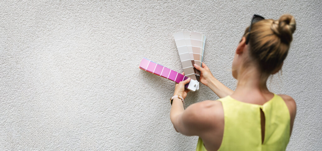
Selecting the perfect paint seems simple until you’re standing in front of a wall of swatches wondering why nothing looks quite right. As designers, we see the same issue over and over again: people pick paint colors in isolation. They fall in love with a hue on a tiny chip at the paint store, but once that color hits the walls—surrounded by their furniture, lighting, and finishes—it tells a very different story.
Paint is powerful, but it doesn’t exist alone. Understanding hue, tint, tone, and the fixed elements already in your space can make the difference between a room that feels effortless and one that feels “off,” even if you can’t pinpoint why.
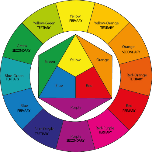
1. Choosing Paint Without Considering HUE
A hue is the purest form of a color—red, blue, green, yellow. Easy, right? Not quite.
Most people assume blue is just blue. But every hue has an undertone, and this is where mistakes happen. That “perfect” soft gray blue may lean purple when paired with warm oak floors. A cool green might suddenly look minty next to beige carpet.
How to avoid the hue mistake:
Always place swatches next to your existing finishes—flooring, countertops, tile, wood, fabrics—so you can see how the undertones interact. Colors shift drastically depending on what surrounds them.
2. Overlooking Tints and Tones
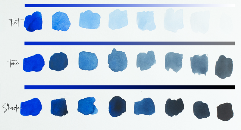
Once you move beyond pure hue, you enter the world of tints, tones, and shades—where depth, softness, and richness happen.
Tint = color + white
Tints are lighter, softer versions of a hue. People often select tints thinking they’ll be “safe.” But a tinted color can wash out in a bright room or turn pastel unexpectedly.
Tone = color + gray
Tones are more muted and sophisticated. They’re often wonderful for creating calm interiors—but they can become muddy if paired with overly bright décor.
A common mistake? Choosing a tinted or toned color without understanding how light or existing finishes will influence it.
How to avoid it:
Test large samples on multiple walls. Tints will look different in daylight vs. evening. Tones may deepen unexpectedly. Observe for at least 48 hours.
3. Ignoring the Room’s Existing Elements
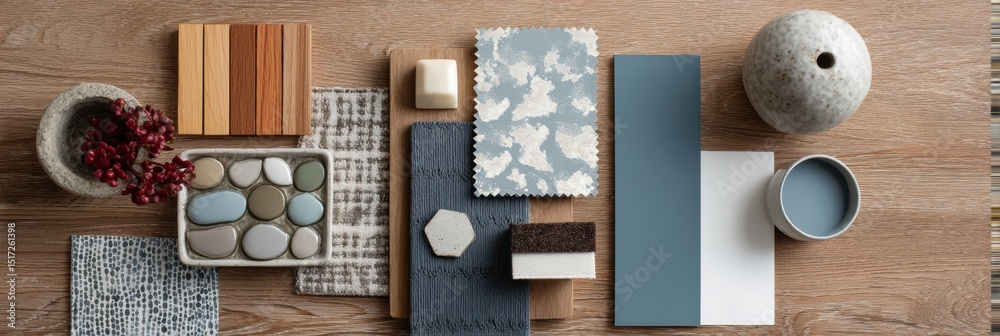
The biggest paint blunder is trying to force a color that fights with the room’s permanent features.
- flooring
- cabinetry
- countertops
- fireplace stone
- large furniture pieces
- fabric colors
- and especially wood undertones
All of the above dictate what paint colors will actually work.
A gorgeous warm greige might clash with cool gray tile. A fresh white can appear yellow next to crisp Carrera marble. Rich jewel tones may compete with warm, orange-toned woods.
Paint should harmonize with what’s already in the space—not correct it.
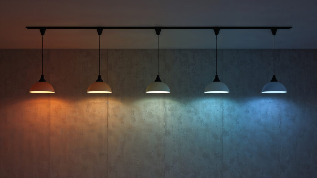
4. The Lighting Factor (The Silent Influencer)
Even if you choose the perfect hue, tint, or tone, lighting can undo it all.
Natural light changes throughout the day. North-facing rooms will cool colors. South-facing rooms will warm them. LED bulbs can skew colors green or blue. Incandescent lighting warms everything.
Test your paint under every lighting condition your room experiences. A color that looks calm in the morning might glow neon at night.
5. Don’t stand so close!
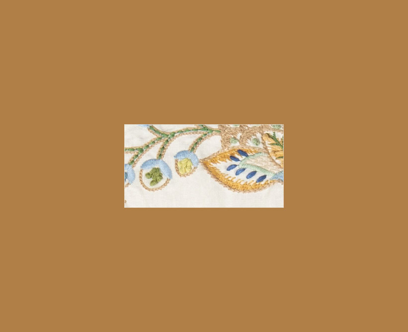
Another common mistake is choosing a paint color based on one small dot or accent color within a fabric rather than considering the fabric as a whole. While those tiny details add interest up close, they rarely represent how the fabric actually reads in the room. From a normal viewing distance, your eye blends the pattern together and responds to the overall mood and dominant tone—not the smallest pop of color. Selecting paint based on the fabric’s overall feel creates harmony and balance, allowing the walls to support the design instead of competing with it.
Take, for example, this light, fresh embroidered fabric. When looking at the fabric up close, you might focus on one of the warm golden accent colors and think Benjamin Moore Golden Meadow 2165-20 would be a perfect match. On a small scale, it appears to coordinate beautifully. However, when I step away, the undertone and intensity of the paint creates several problems:
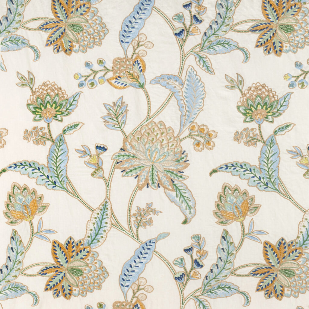
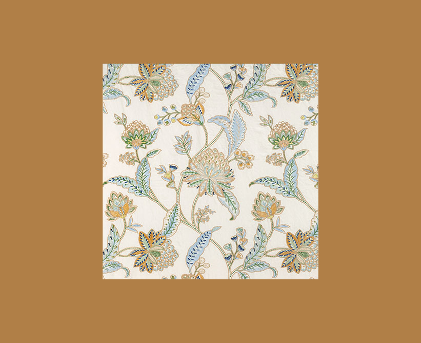
- It’s too heavy and saturated. The strong caramel/tan visually overwhelms the much lighter fabric instead of supporting it.
- The undertone is too orange. The tan leans toward caramel/rust, while the fabric’s background and colors are softer and more muted. That orange cast makes the blues and greens feel somewhat disconnected.
- There’s too much contrast with the fabric ground. Your fabric has a creamy, almost natural-linen background. The abrupt jump to the dark tan makes the fabric look like it’s sitting on the color rather than belonging with it.
- It emphasizes the brown/gold threads instead of the prettier colors. Ideally, the wall color should allow the blue and green embroidery to become more noticeable. This tan pulls your eye toward the ochre and brown portions instead.
- It changes the personality of the fabric. The fabric feels refined, traditional and slightly botanical. This particular tan reads heavier and more Southwestern/earthy.
A better option for this fabric is to use Benjamin Moore Watercolor CC-788. This blue works much better because it supports the fabric rather than competing with it. It makes the entire combination feel lighter, fresher, and more intentional. It works because:
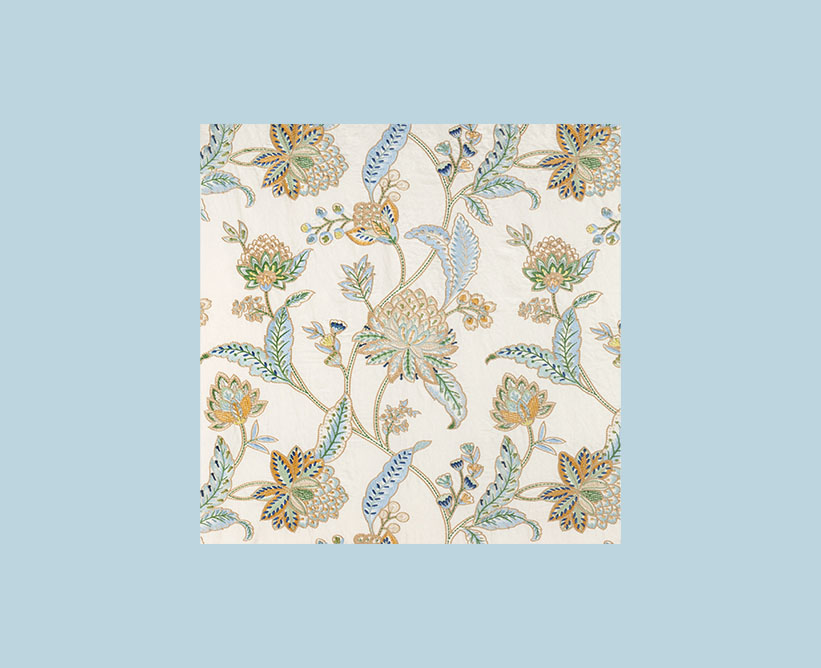
- It pulls directly from the fabric. The background blue relates closely to the soft blues woven throughout the floral pattern, so there is an immediate visual connection.
- It lets the warm colors become accents. Against the blue, the gold, ochre, tan, and soft brown details become warmer and richer. With the previous tan background, those colors tended to disappear into it.
- It balances the warm and cool tones. The fabric contains both warm golds and tans and cool blues and greens. The blue background strengthens the cool side of the palette, creating a much more balanced composition.
- The intensity is appropriate. This is a soft, somewhat grayed blue rather than a strong saturated blue. It doesn’t overpower the delicate embroidery.
- The cream ground looks cleaner. Notice how much fresher the off-white fabric background appears against this blue. Against the caramel tan, that same cream could begin to look slightly dingy or yellow.
- The greens transition beautifully. The soft sage and blue-green leaves create a bridge between the blue background and the warmer flowers, so your eye moves naturally through the entire palette.
- It gives the pattern breathing room. The fabric is fairly detailed. A quiet blue provides a calm visual field around it, allowing you to appreciate the intricacy of the pattern.
- It feels more sophisticated. The blue makes the fabric read as an elegant botanical rather than emphasizing its earthy side. For an interior, I think that’s an important distinction.
Most importantly, the blue doesn’t need to be an exact match to one thread in the fabric. In fact, I prefer that it isn’t. It’s related enough to belong to the palette but different enough to give the fabric dimension.
6. THE SOLUTION – Pick paint colors last!
The best option is to select paint colors last. With the unlimited paint options available, finding the perfect paint to match your fabrics is much easier than trying to find the perfect fabric to match your paint color.
Remember,
• Paint is the easiest thing to change.
• It has the most variations available.
• It must support the undertones of your existing items.
By choosing paint last, you ensure harmony across the entire room—furniture, flooring, fabrics, lighting, and décor. If you still feel overwhelmed you can call us for a profeesional paint consultation to ease your mind and ensure the correct color is selected.